
Most businesses have more data than they can comfortably use. Reports keep growing. Dashboards keep filling up. Teams keep tracking more and more numbers. Yet the hard part is rarely collecting data. The hard part is making sense of it.
That is where storytelling with data matters. Numbers on their own can tell you what happened. They do not always tell you why it happened or what to do next. A chart can be accurate and still leave people confused. A dashboard can be full of useful information and still fail to move a decision forward.
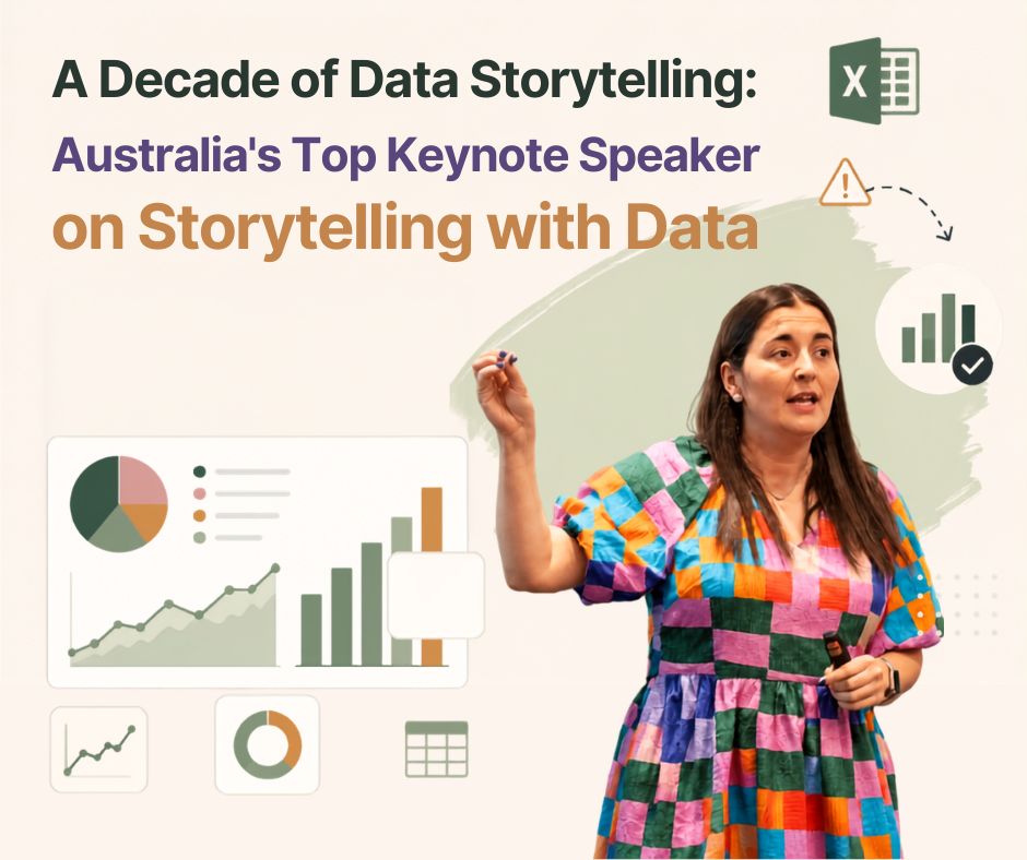
Selena Fisk’s website reflects that same idea in a very practical way. Her focus is on data storytelling, data literacy and data visualisation. She describes herself as a data storyteller and a keynote speaker who helps people bring data to life so it can support evidence-informed decisions. That is a useful place to start because the goal is not to make data look impressive. The goal is to make it useful.
Why data alone does not drive decisions
A lot of teams still assume that better decisions come from having more data. In practice it usually does not work that way.
If a report is too dense people skim it. If a dashboard is too crowded people ignore it. If the message is unclear people debate the numbers instead of acting on them. The problem is not the lack of information. The problem is the lack of clarity.
That is why storytelling with data has become such an important business skill. It helps people move from information to understanding. It gives context to the numbers. It helps the audience see what matters and what should happen next.
In a marketing report for example a list of metrics might show traffic clicks conversions and engagement. But unless someone explains which campaign drove the strongest outcome the team still has to figure out the meaning for themselves. The same is true in sales dashboards customer analytics and executive presentations. Data is valuable. Understanding is what makes it actionable.
Why data visualization changes the conversation
Good data visualization does more than make a report look polished. It helps people understand patterns faster.
The brain can process a visual signal much more quickly than a table full of figures. That is why a simple line chart can make a trend obvious in seconds while rows of numbers can hide the same pattern completely. A well chosen visual guides attention. It helps the viewer see what is changing what is stable and what needs action.
This is also where many business reports go wrong. They try to show everything. They use too many colours. They rely on the default chart. They stack too many metrics into one view. The result is noise.
A good visual should help people understand the message at a glance. It should draw attention to the insight instead of distracting from it. That is why data visualization is an important part of data storytelling. It helps people see what matters without having to work through every number.
Where business reports and dashboards often miss the mark
Most report problems are not really design problems. They are clarity problems.
A sales dashboard may include ten useful metrics but no one knows which number matters most. A customer report may show churn rates but not explain what changed. An executive slide may be full of charts but still leave the room asking what decision needs to be made.
That is a common pattern. Teams gather data. They present it. They assume the audience will connect the dots. Often the audience cannot.
The best reports do not overwhelm people with detail. They give them a clear path through the information. They start with the key insight. They use the right visual. They cut away anything that does not help the audience understand the message.
That is why organizations increasingly invest in data storytelling training. They do not just want nicer charts. They want clearer thinking across reports dashboards and presentations.
Why organizations invest in data storytelling training
Many people in business were never taught how to talk about data. They know how to collect it and maybe how to analyze it. But presenting it in a way that is easy to follow is a different skill.
That is where data storytelling training becomes valuable.
Good data storytelling training encourages teams to think differently before they build a report or presentation. Instead of starting with charts they start with the audience and the decision that needs to be made. Once that is clear it becomes much easier to focus on the most important insight choose the right visual and remove anything that does not add value.
Those are practical questions. They improve communication immediately. They also help teams build habits that carry into future work.
Selena Fisk’s website shows that she works across keynote speaking workshops and storytelling in corporate training programs with the same broader goal in mind. Her work is not about making data feel complicated. It is about helping people engage with it more confidently. That is a big reason organizations look for an experienced data storytelling speaker. They want someone who can help the whole room think differently about data not just explain a theory.
How experienced speakers and workshops help
A strong data storytelling speaker does more than present ideas. They help people reframe how they think about communication.
In a keynote people often get the big picture. They see why storytelling with data matters. They understand why a report can be technically correct and still be ineffective. They start to notice the gap between showing numbers and explaining them.
Workshops take that learning a step further because people get the chance to apply what they have learned. Instead of only discussing concepts teams work through real examples and see how small changes can make a report or presentation much clearer. They learn how to simplify complex slides focus on the most important insight and communicate their recommendations with greater confidence.
That is the value of a data storytelling speaker Australia based teams can learn from. The point is not geography alone. The point is experience that feels relevant to the way local organizations communicate and make decisions.
Practical examples of storytelling with data in business
You can see the difference everywhere once you start looking for it.
In marketing reports storytelling with data helps identify which campaign actually drove the result instead of listing every metric equally. In sales dashboards it helps leaders see whether the team is on track or whether one region needs attention. In customer analytics it helps explain why customers leave not just where they leave.
Executive presentations need it even more. Senior leaders usually do not need every supporting detail. They need the takeaway. They need the business implication. They need the recommendation. A good story with a clear chart gets there faster than a slide deck full of disconnected data.
Business intelligence reporting also improves when the story is clear. BI tools can generate a lot of output. But output is not insight until someone interprets it in a way that the audience can understand and use.
How to improve your own data storytelling skills
You do not need to be a designer or analyst to improve this skill. You just need a better process.
Start with the audience. Before choosing a chart ask who it is for and what they need to decide. An executive does not need the same level of detail as an analyst. A marketing manager does not need the same angle as a finance lead.
Then identify the key insight. If people remember only one thing what should it be? That should guide the whole report. If the insight is not clear the rest of the visual will not help much.
Next choose the right visual. A trend needs a different shape from a comparison. A relationship needs a different view from a ranking. The chart should match the message.
After that remove complexity. Cut away the extra labels the extra colours and the extra metrics that do not support the point. Simpler almost always reads better.
Then build a logical story. Move from context to insight to action. Show what happened. Explain why it matters. End with what should happen next.
The last step is easy to miss but it is often the most useful. Always end with a clear recommendation. A data story without a next step is just information.
Why this work matters now
The need for clear communication is only growing. More people are being asked to work with data every day. More teams rely on dashboards and analytics to make decisions. More organizations want people who can explain data in a way that is practical and human.
That is why data storytelling training is becoming more valuable. It gives teams a shared language. It reduces confusion. It helps organizations make better use of the data they already have.
It also explains why so many businesses look for a data storytelling speaker who can bridge the gap between technical analysis and everyday communication. The best speakers do not just teach people to create prettier slides. They help them make better decisions.
Selena Fisk’s website positions her work around that idea. She focuses on data storytelling data literacy and data visualisation through keynote speaking workshops and training. For readers and organizations that want to improve how they communicate with data that combination makes sense.
FAQs
What is data storytelling?
It is the practice of combining data visuals and narrative so people can understand information more quickly and use it to make decisions.
Why is data storytelling important?
Because data on its own does not always lead to action. People need context and clarity before they can use the numbers well.
What does a data storytelling speaker do?
A data storytelling speaker helps audiences understand how to turn complex data into clear messages through keynotes workshops and training.
Why should organizations invest in data storytelling training?
It helps teams communicate more clearly build better reports and make stronger decisions from the data they already have.
How does data visualization improve communication?
It makes patterns easier to see and helps people understand trends comparisons and outliers faster.
Who benefits from data storytelling training?
Business leaders analysts marketers educators and anyone who needs to explain data to others.
How can I improve my data storytelling skills?
Start by understanding your audience focusing on one insight choosing the right visual and ending with a clear recommendation.
What makes a good business presentation using data?
A good presentation is focused easy to follow and built around one clear message with supporting evidence.
Why do companies look for a data storytelling speaker Australia based teams can relate to?
They want someone who can help their teams communicate with data in a practical way that feels relevant to their environment.
Is data storytelling only for analysts?
No. It is useful for anyone who presents ideas reports results or supports decisions with data.
Conclusion
Data is still one of the most valuable tools in business. But data only works well when people can understand it. That is why storytelling with data matters so much. It turns numbers into meaning. It helps data visualization do its job. It makes reports dashboards and presentations easier to act on.
For organizations the real gain is not just better slides. It is better communication. That leads to better decisions.
Professionals and teams that want to strengthen those skills can learn a lot from Selena Fisk’s keynote speaking workshops and training programs. Her work on data storytelling data literacy and data visualisation offers a practical path for anyone who wants to communicate with data more clearly.
What's Included
- data strategy keynote speaker